Vitalea Spa.
A site that breathes a little slower than the rest of the internet.
Most spa websites in 2025 look like 2008 Squarespace. Stock photos of women laughing at salads. Three different "Book Now" buttons screaming at you. Royal blue and gold for some reason.
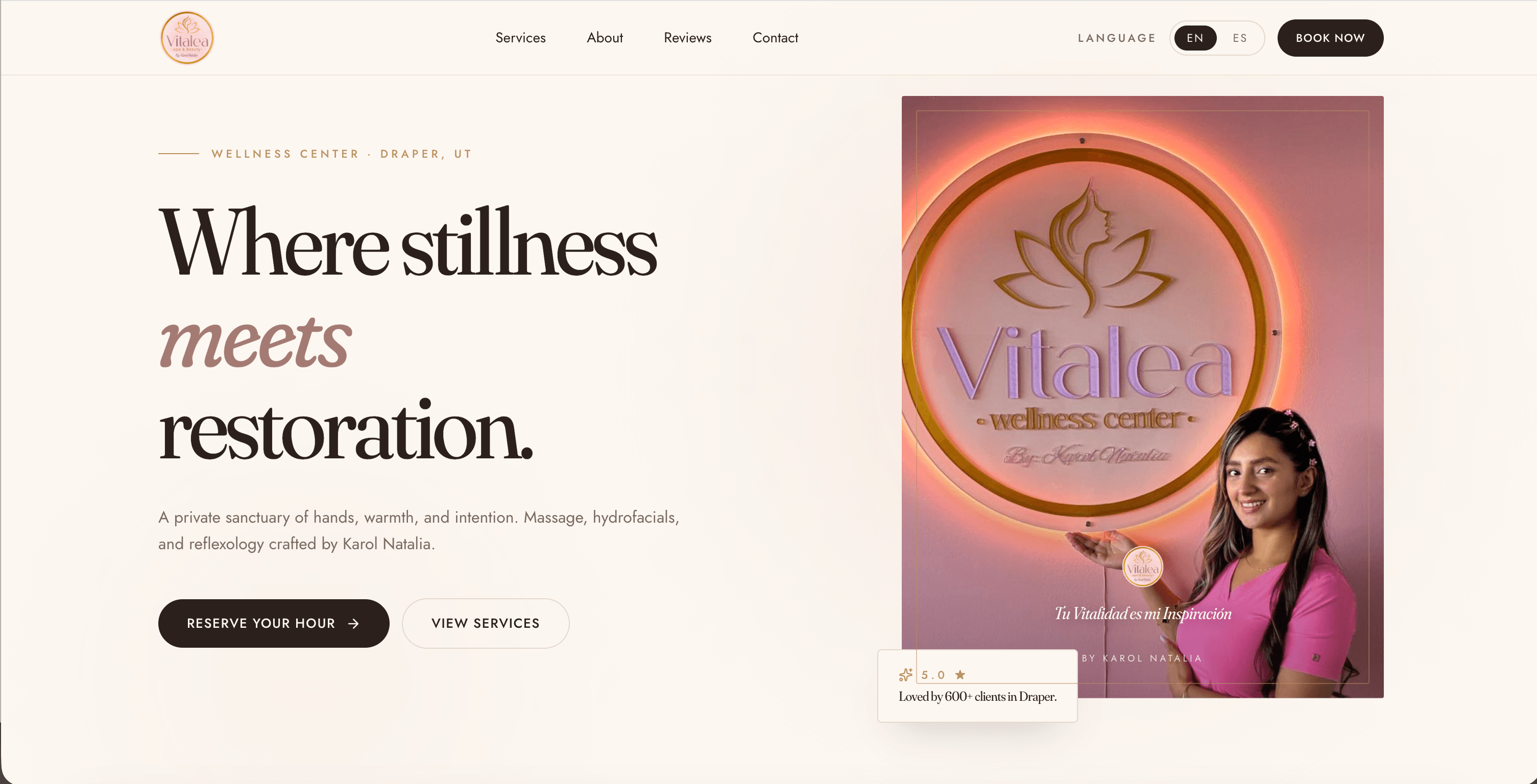
Vitalea's owner wanted the opposite — a site that felt like the spa itself. Quiet. Slow. Confident. The kind of place you don't need to oversell because the work speaks.
Set the palette before the site: sage, bone, spring water. Three colors. Type in Fraunces for warmth, Inter Tight for legibility, no third typeface, no exceptions.
Built the scroll on Lenis so it actually feels physical. Hero copy reveals on GSAP scroll triggers, paced slow enough that it earns the wait.
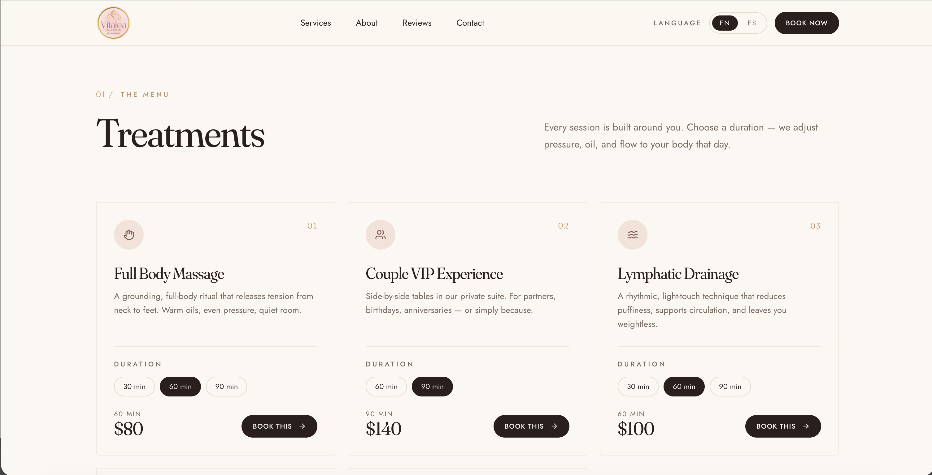
Wired up the booking flow as a single-page form with progressive disclosure — service first, time second, contact third. No three-step wizard. No account required.
Photographed everything on location ourselves. No stock. The owner is in the frame.
"The internet is loud. Wellness brands online are louder. We turned the volume down."
 home · slow scroll
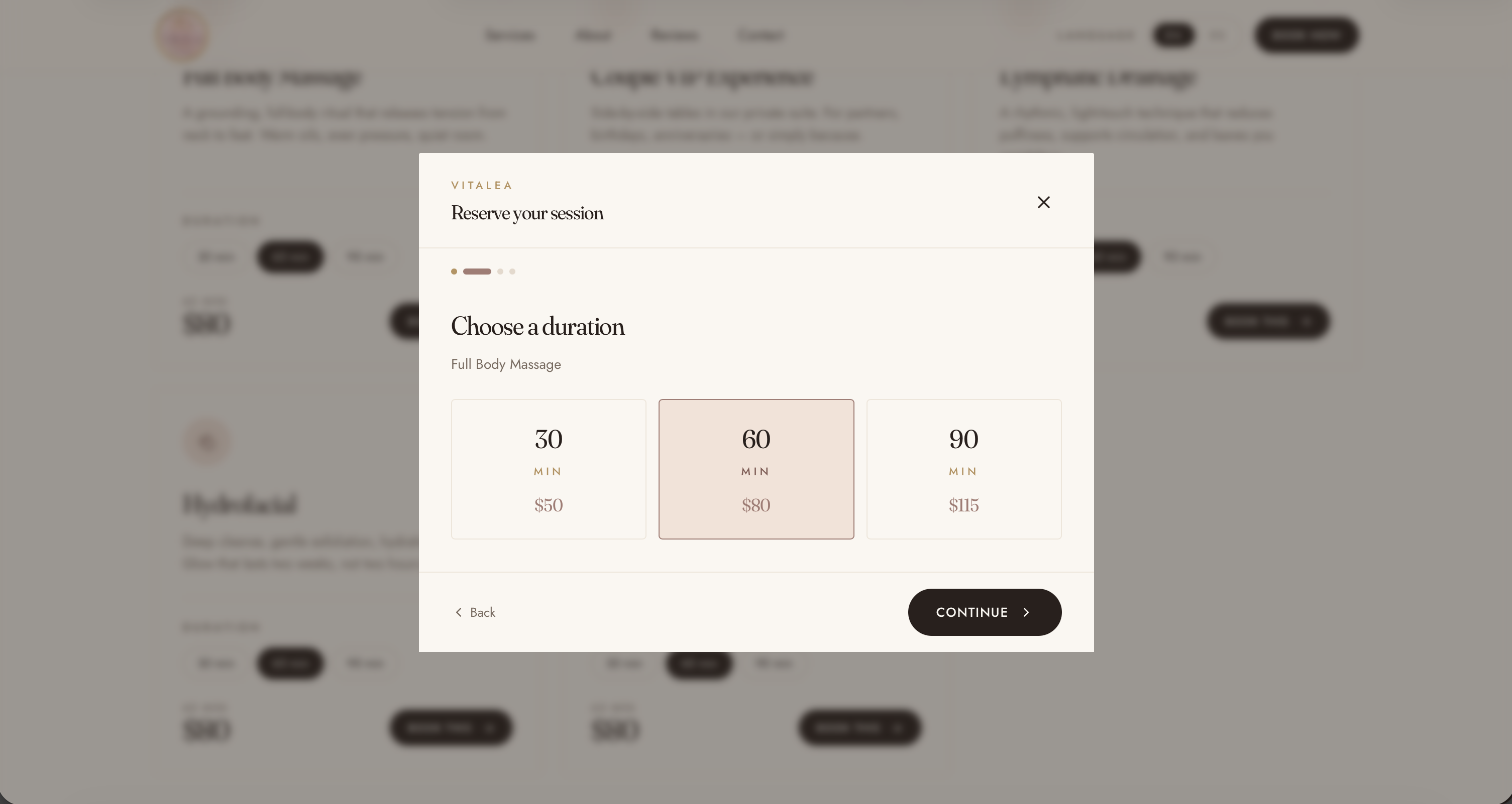 booking · calendar
Bookings up. Returning client rate up. Owner happier — which, for a wellness business, is structurally important.